Sennelier Watercolour Review Read More »
Uncategorized


 Connect With Me
If you’re curious about botanical art, want to see what I’m working on, or are interested in my handmade watercolours, you can find me here:
Let’s keep the botanical conversation blooming.
🍂 Introducing My Autumn-Inspired Handmade Watercolour Palette Read More »
Uncategorized


If you’re curious about botanical art, want to see what I’m working on, or are interested in my handmade watercolours, you can find me here:
Let’s keep the botanical conversation blooming.
Why Are Handmade Watercolours So Expensive? Read More »
Uncategorized


If you’re curious about botanical art, want to see what I’m working on, or are interested in my handmade watercolours, you can find me here:
Let’s keep the botanical conversation blooming.
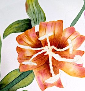
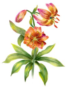
🌸 The Allure of Lilies: Why I Keep Coming Back to This Flower in My Botanical Art Read More »
Uncategorized

For those who have supported my handmade paints, thank you for being part of this journey. Your enthusiasm and feedback have been invaluable. While availability may be limited, you can expect the same level of care and quality in every batch of paint that I make.
I am so excited for what I have planned! I’m taking my time in making decisions and allowing my creativity flow. Allowing myself the space to paint has also allowed my thirst for paintmaking to grow too.
I feel that while I am excited for more, I need to keep the balance and maintain my creativity with my paintings.
And as I devote more time to painting, I’ll continue to share tips, techniques, and inspiration through my blog and videos.
Make sure you sign up to my Newsletter & Patreon for the exclusive news. You can also find me below on social media.
Handmade Paints – Why I Chose to Step Back Read More »
Uncategorized


Follow me on social media for updates, behind-the-scenes looks, and inspiration:
Contact Details
Have questions or need assistance? Reach out anytime:
Email: penholderart@hotmail.com
FAQ
Find answers to common questions about custom commissions, shipping, and more on my FAQ page.
Subscribe
Sign up for my newsletter to receive exclusive updates, offers, and art tips: Subscribe here.
How To Commission An Artist Read More »
Uncategorized (Beginner to Advanced)

In order to get the best out of this technique try the following:
 Wait for your first layer to dry completely. Applying paint on top too soon and result is a mess – patience is key!
 Paint consistency is important. To achieve the best layers keep your paint more diluted. If you paint too thickly when you go to glaze the first paint layer will lift.
In no time at all will you master these watercolour techniques every artist should know.

 Water control is everything!
You don’t want it too wet nor do you want it too dry. There will be a lot of factors influencing this including but not limited to: weather, paper thickness, paper texture, paper type and paint consistency.
Don’t be afraid to experiment.

This one requires some experimenting.
Paper – I find this works best on cold pressed watercolour paper. It will work on hot pressed but it wont look as good.
Not every colour is equal. Some colours will not react with the salt, it’s the nature of the beast. Try experimenting with colours to see which ones work best.
 Try different kinds of salt. Here I have used regular table salt, try rock salt and see what happens.

5 Watercolour Techniques Every Artist Should Know (Beginner to Advanced) Read More »
Uncategorized

How To Make Handmade Watercolor Paints Read More »
Uncategorized


 Instagram
 Youtube